Your school website is key source of information for parents, students, staff and the community, but there is certain content that you must always have visible on your website, and which will be checked by Ofsted inspectors prior to a visit.
We have a full guide to all of these requirements which is available to download for free from our website, but one of the key area of focus which our account executives are often asked about is curriculum.
The DfE school website requirements (last updated February 2021) state that all schools must publish the following information on their school website:
- the content of your school curriculum in each academic year for every subject, including Religious Education even if it is taught as part of another subject or subjects, or is called something else
- how parents or other members of the public can find out more about the curriculum your school is following
- the names of any phonics or reading schemes you’re using in key stage 1
- a list of the courses available to pupils at key stage 4, including GCSEs
Your approach to the curriculum should also include how you are complying with your duties in the Equality Act 2010 and the Special Educational Needs and Disability Regulations 2014 about making the curriculum accessible for those with disabilities or special educational needs.
You must also publish information about your school’s remote education provision on your website.
This is quite a lot to process – but using built-in content templates and logical navigation options, you can ensure that this information is displayed quickly, easily and efficiently and can be accessible by all of your key stakeholders.
Where your curriculum content should sit on your website
Many of our schools choose to either have a top-level navigation menu called ‘Curriculum’ which takes you directly to the content or they opt for a top-level menu item called Academics or Learning which then has a sub-page called Curriculum, along with other elements of teaching information such as forest school, extracurricular, staff lists etc.
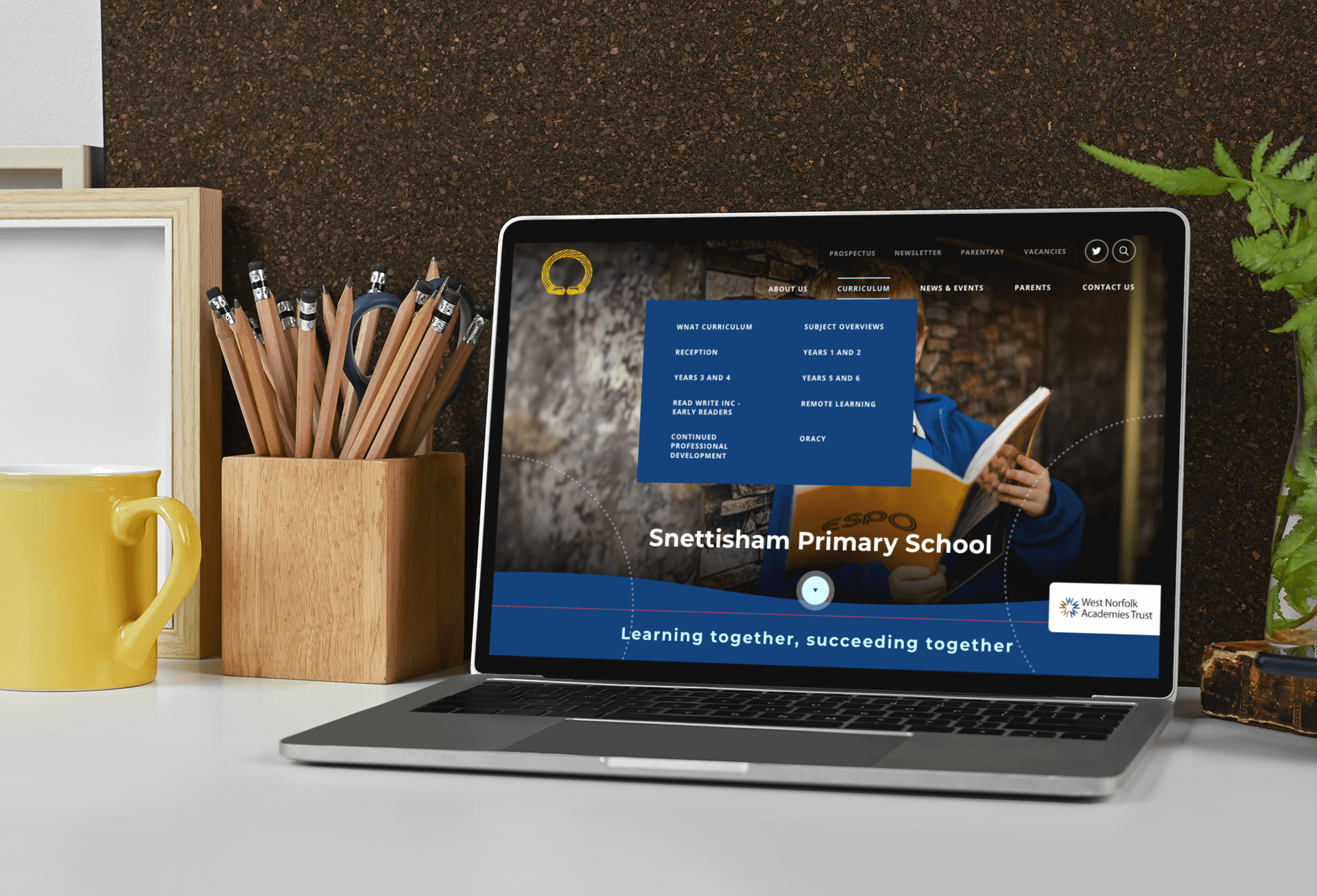
Wherever you choose to place your content, it’s important that it is easily signposted from the homepage and accessible within a maximum of 3 clicks.
As well as providing a good user experience (UX), this will also allow parents and other members of the public to find out more about the curriculum your school is following.
How to display your curriculum content on the page
Once you’ve chosen the location for your curriculum area – you then need to determine how to display the content in a way that is easy to read and allows you to share information on each different subject that you teach. Some of the best ways to do this are:
Using content templates; such as accordions
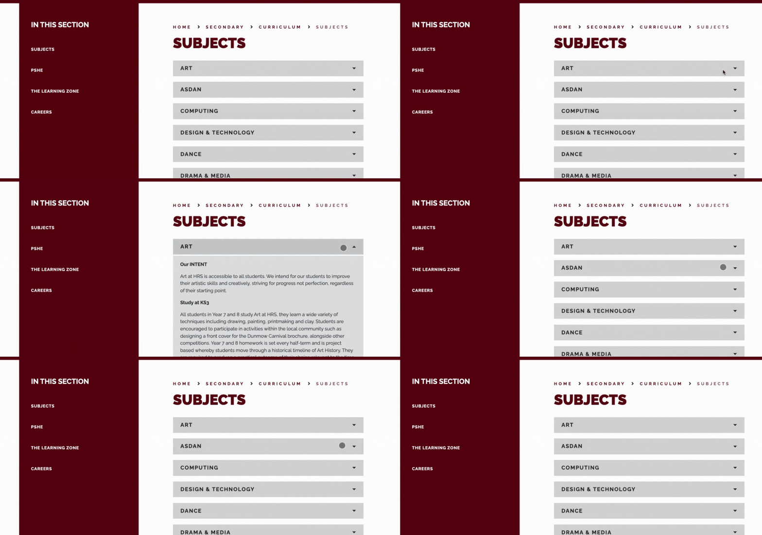
Helena Romanes School has all the subject information for each key stage within one page but the content is broken down into accordions. Accordions allow you to see all of the topics at once, but give you the choice to read more in depth on the subject you’re interested in, without leaving the page. All you have to do is click the title box and it will drop-open to reveal more content.
Individual pages for each content subject
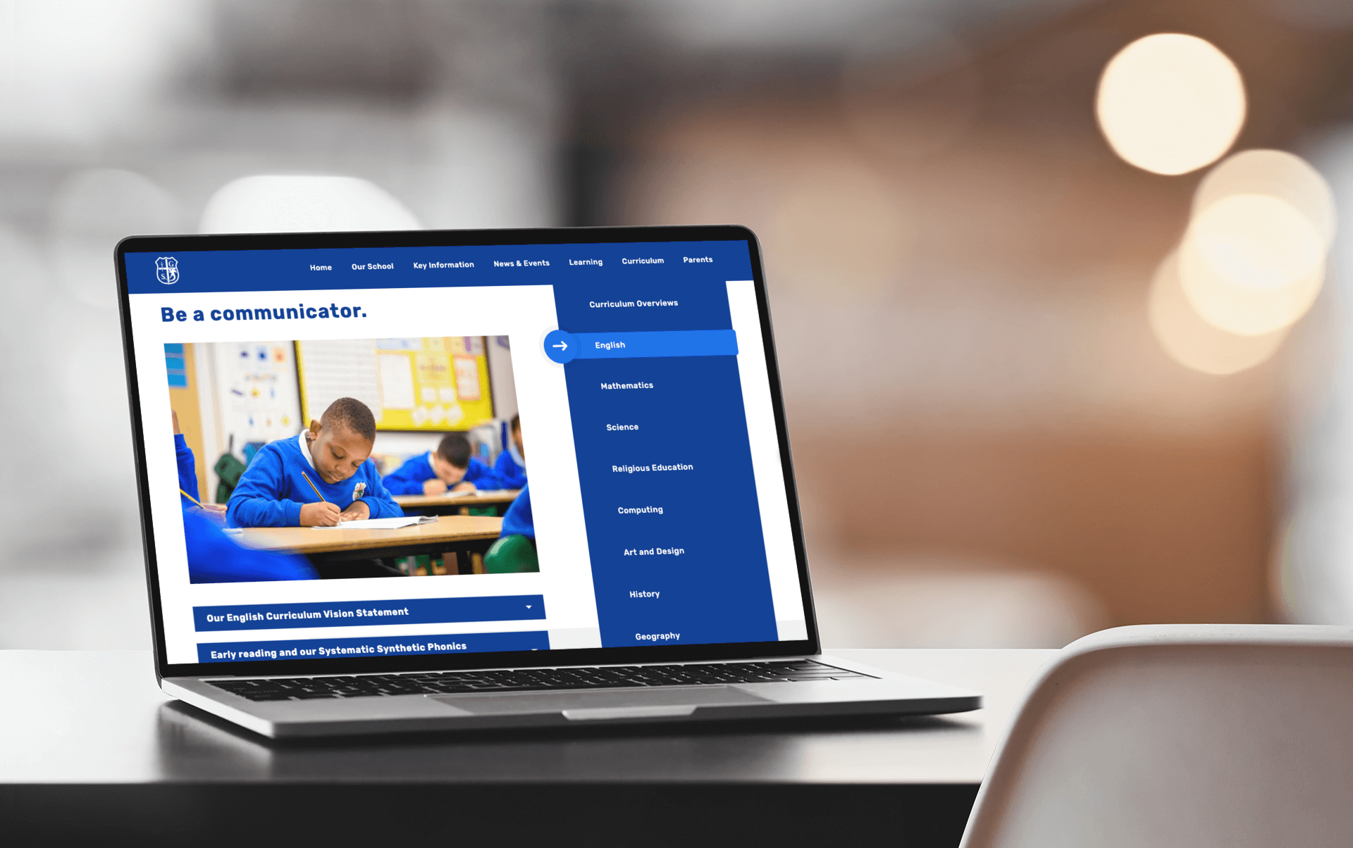
St George’s is a great example of how you can use an individual page for each subject within your website.
When you click into a specific subject page from the navigation menu, there is then a quote and photo of the pupils studying that topic – providing social proof and real-world context – followed by accordion sections – so it’s easy to jump to the information you want to read.
In their English section, they have created an accordion within the page about phonics, to easily cover the specific point in the guidance about sharing the names of any phonics or reading schemes you’re using in key stage 1.
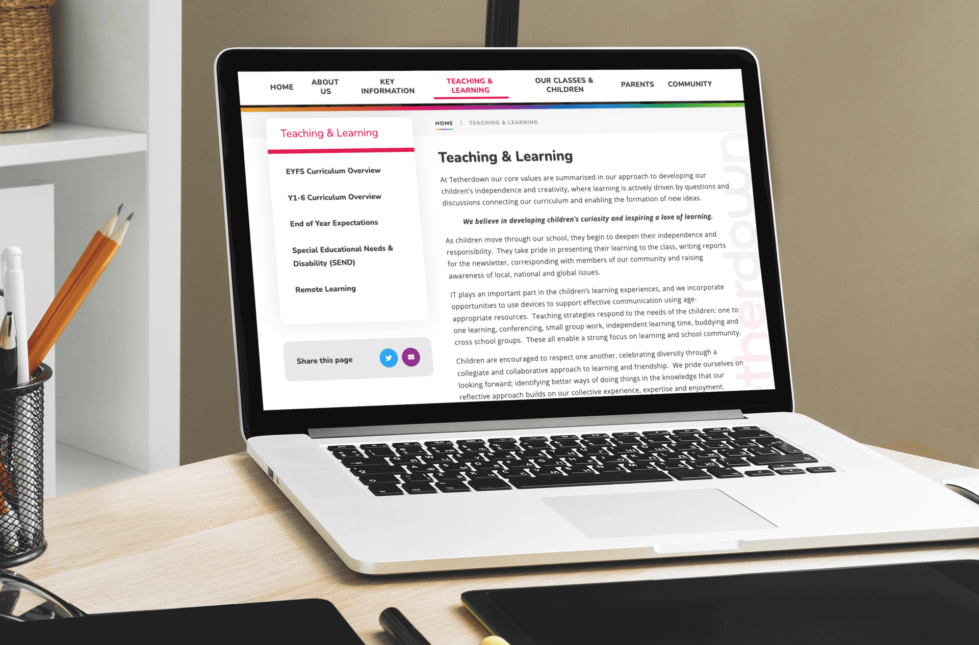
Cottingham High School & Sixth Form has a similar style of layout whereby you can view individual subject pages. Cottingham High break their content down by subject and then split it into KS3 and KS4 sections, emphasising their offering for each stage with videos and links. Tetherdown School take all of this a step further, by not only having dedicated pages for each subject within their Teaching and Learning area, but also sharing information on curriculum overviews, expectations, SEND requirements and remote learning as well.
Sub-navigation grids
Another way of displaying your subjects is through a sub-nav grid, which whilst still requiring a page per subject, gives a more aesthetic overview than just a textual list.
A great example of this is Copleston High School - each subject is displayed as a tile in a grid, so you can get a full overview of the whole curriculum, before choosing which page you wish to view. Within each page, they then share links, PDFs and imagery, to complement the information shared.

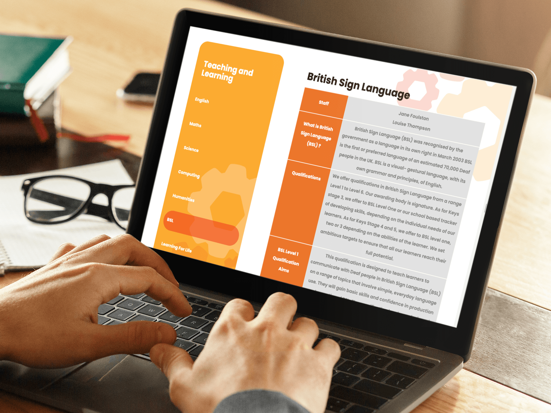
Braidwood Trust School for the Deaf also have a tiled sub-navigation grid to display their subjects, but they have chosen to lay their sub-pages out in a tabular fashion, sharing details about the staff who teach the subject, what is covered at each Key Stage, further reading information and future careers associated with each subject.
Lutterworth High have also chosen to use the sub-nav grid option, but instead of breaking their content down by subject like the other examples, they break theirs down by key stage area.
They then show all of the subjects on one page, using accordions to ensure the page doesn’t endlessly scroll and is user friendly.

Bespoke curriculum areas
If you are really passionate about your curriculum, you may choose to invest in a bespoke area which gives you more individuality in order to present your content in a unique way.
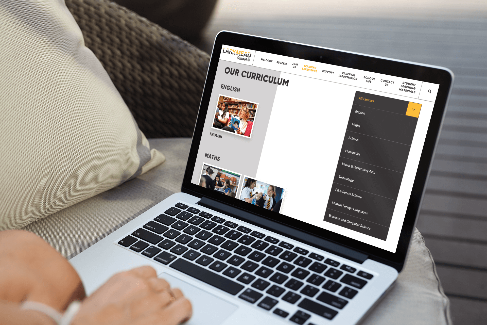
Larkmead School have a fantastic bespoke curriculum area with a custom design and filters in order to segment their content by area and then by subject within.
In summary:
When organising your curriculum content, make sure you have remembered these 6 key points:
- Ensure your content can be found in your navigation within 3 clicks
- Don’t forget to include links off to your Equality Act and SEND policies
- Check that the formatting of your content is accessible, easy to read and covers information about every subject including Religious Education
- Make sure that if you’re a primary school, you cover the names of any KS1 phonics or reading schemes, and if you’re a secondary, that you list the courses available at KS4
- Cover off your remote learning provision options in the event of a school closure
- Engage your audience – think visual cues as well as text – so imagery, videos and content templates
Thinking about updating your website?
If you don't currently work with e4education:
If you're an existing e4education customer:
- Websites
- Top Tips
You might also like...
New year, new start
A new year (calendar or academic) is the chance for a fresh start. Goals are set, mistakes are relegated to the past and there’s generally a feeling of ‘newness’ in the air. Whether you’re looking for a new school website design, wanting to improve your school newsletter f...
A new era of website support from e4education
In preparation for the new academic year, we’re making some changes to our online support resources to allow our customers even better access free support, advice and training.
